Data Visualization with Matplotlib
- 15 minsThis is the third tutorial of the Explained! series.
I will be cataloging all the work I do with regards to PyLibraries and will share it here or on my Github.
I will also be updating this post as and when I work on Matplotlib.
That being said, Dive in!
Data Visualization with Matplotlib
In the Python world, there are multiple tools for data visualizing:
- matplotlib produces publication quality figures in a variety of hardcopy formats and interactive environments across platforms; you can generate plots, histograms, power spectra, bar charts, errorcharts, scatterplots, etc., with just a few lines of code;
- Seaborn is a library for making attractive and informative statistical graphics in Python;
and others (particularly, pandas also possesses with its own visualization funtionality).
Here, we will consider preferably matplotlib. Matplotlib is an excellent 2D and 3D graphics library for generating scientific, statistics, etc. figures. Some of the many advantages of this library include:
- Easy
- Great control of every element in a figure, including figure size and DPI.
- High-quality output
- GUI for interactively exploring figures.
Working with Matplotlib
import matplotlib.pyplot as plt
# This line configures matplotlib to show figures embedded in the notebook,
# instead of opening a new window for each figure. More about that later.
%matplotlib inline
import numpy as np
To create a simple line matplotlib plot you need to set two arrays for x and y coordinates of drawing points and them call the plt.plot() function.
pyplot is a part of the Matplotlib Package. It can be imported like :
import matplotlib.pyplot as plt
Let’s start with something cool and then move to the boring stuff, shall we?
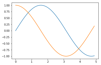
The Waves
import numpy as np
import matplotlib.pyplot as plt
"""
numpy.arange([start, ]stop, [step, ]dtype=None)
    Return evenly spaced values within a given interval.
    Only stop value is required to be given.
    Default start = 0 and step = 1

"""
x = np.arange(0,5,0.1)
y = np.sin(x)
y2 = np.cos(x)
plt.plot(x, y)
plt.plot(x,y2)
plt.show()
Back to The Basics
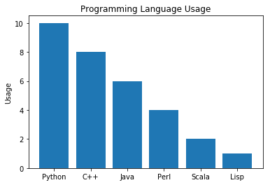
Bar Charts
A diagram in which the numerical values of variables are represented by the height or length of lines or rectangles of equal width.
objects = ('Python', 'C++', 'Java', 'Perl', 'Scala', 'Lisp')
x_pos = np.arange(len(objects)) # Like the enumerate function.
performance = [10,8,6,4,2,1] # Y values for the plot

# Plots the valueswith x_pos as X axis and Performance as Y axis
plt.bar(x_pos, performance)

# Change X axis values to names from objects
plt.xticks(x_pos, objects)

# Assigns Label to Y axis
plt.ylabel('Usage')

plt.title('Programming Language Usage')
plt.show()
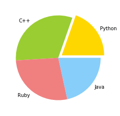
Pie Chart
A pie chart (or a circle chart) is a circular statistical graphic, which is divided into slices to illustrate numerical proportion.
import matplotlib.pyplot as plt

# Data to plot
labels = ('Python', 'C++', 'Ruby', 'Java')
sizes = [10,16,14,11]

# Predefined color values
colors = ['gold', 'yellowgreen', 'lightcoral', 'lightskyblue']

# Highlights a particular Value in plot
explode = (0.1, 0, 0, 0)  # Explode 1st slice

# Plot
plt.pie(sizes, explode=explode, labels=labels, colors=colors)


plt.show()
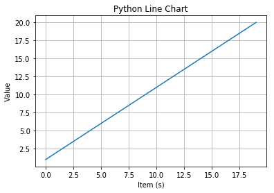
Line Chart
The statement:
t = arange(0.0, 20.0, 1)
defines start from 0, plot 20 items (length of our array) with steps of 1. We’ll use this to get our X-Values for few examples.
import matplotlib.pyplot as plt

t = np.arange(0.0, 20.0, 1)
s = [1,2,3,4,5,6,7,8,9,10,11,12,13,14,15,16,17,18,19,20]
plt.plot(t, s)

plt.xlabel('Item (s)')
plt.ylabel('Value')
plt.title('Python Line Chart')
plt.grid(True)
plt.show()
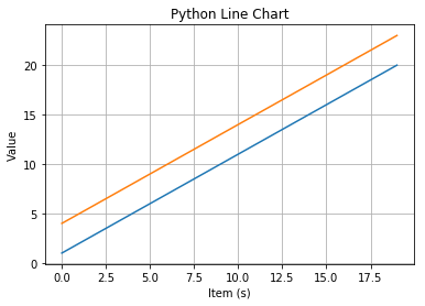
import matplotlib.pyplot as plt

t = np.arange(0.0, 20.0, 1)
s = [1,2,3,4,5,6,7,8,9,10,11,12,13,14,15,16,17,18,19,20]
s2 = [4,5,6,7,8,9,10,11,12,13,14,15,16,17,18,19,20,21,22,23]
plt.plot(t, s)
plt.plot(t,s2)

plt.xlabel('Item (s)')
plt.ylabel('Value')
plt.title('Python Line Chart')
plt.grid(True)
plt.show()
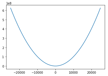
Okay, now that that’s taken care of, let’s try something like $y =x^2$
import matplotlib.pyplot as plt

a=[]
b=[]
# Try changing the range values to very small values
# Notice the change in output then
for x in range(-25000,25000):
    y=x**2
    a.append(x)
    b.append(y)

plt.plot(a,b)
plt.show()
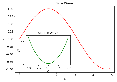
Subplots
Matplotlib allows for subplots to be added to each figure using it’s Object Oriented API. All long we’ve been using a global figure instance. We’re going to change that now and save the instance to a variable fig. From it we create a new axis instance axes using the add_axes method in the Figure class instance fig.
Too much theory? Try it out yourself below.
fig = plt.figure()

x = np.arange(0,5,0.1)
y = np.sin(x)

# main axes
axes1 = fig.add_axes([0.1, 0.1, 0.9, 0.9])  # left, bottom, width, height (range 0 to 1)

# inner axes
axes2 = fig.add_axes([0.2, 0.2, 0.4, 0.4])

# main figure
axes1.plot(x, y, 'r') # 'r' = red line
axes1.set_xlabel('x')
axes1.set_ylabel('y')
axes1.set_title('Sine Wave')

# inner figure
x2 = np.arange(-5,5,0.1)
y2 = x2 ** 2
axes2.plot(x2,y2, 'g')   # 'g' = green line
axes2.set_xlabel('x2')
axes2.set_ylabel('y2')
axes2.set_title('Square Wave')

plt.show()
If you don’t care about the specific location of second graph, try:
fig, axes = plt.subplots(nrows=1, ncols=3)

x = np.arange(-5,5,0.1)
y = x**2
i=1
for ax in axes:
    ax.plot(x, y, 'r')
    ax.set_xlabel('x')
    ax.set_ylabel('y')
    ax.set_title('Square Wave '+str(i))
    i+=1
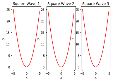
That was easy, but it isn’t so pretty with overlapping figure axes and labels, right?
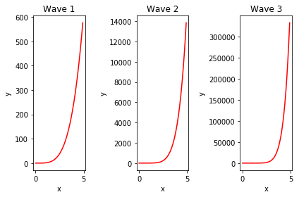
We can deal with that by using the fig.tight_layout method, which automatically adjusts the positions of the axes on the figure canvas so that there is no overlapping content. Moreover, the size of figure is fixed by default, i.e. it does not change depending on the subplots amount on the figure.
fig, axes = plt.subplots(nrows=1, ncols=3)

x = np.arange(0,5,0.1)
y = x**2
i=1
for ax in axes:
    ax.plot(x, y**(i+1), 'r')
    ax.set_xlabel('x')
    ax.set_ylabel('y')
    ax.set_title('Wave '+str(i))
    i+=1
fig.tight_layout()

Above set of plots can be obtained also using add_subplot method of figure object.
fig = plt.figure()

for i in range(1,4):
    ax = fig.add_subplot(1, 3, i)   # (rows amount, columns amount, subplot number)
    ax.plot(x, y**(i+1), 'r')
    ax.set_xlabel('x')
    ax.set_ylabel('y')
    ax.set_title('Wave '+str(i))
    # clear x and y ticks
    # ax.set_xticks([])
    # ax.set_yticks([])
fig.tight_layout()
plt.show()
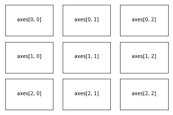
ncols, nrows = 3, 3

fig, axes = plt.subplots(nrows, ncols)

for m in range(nrows):
    for n in range(ncols):
        axes[m, n].set_xticks([])
        axes[m, n].set_yticks([])
        axes[m, n].text(0.5, 0.5, "axes[{}, {}]".format(m, n),
                        horizontalalignment='center')
subplot2grid is a helper function that is similar to plt.subplot but uses 0-based indexing and let subplot to occupy multiple cells. Let’s to see how it works.
fig = plt.figure()

# Let's remove all labels  on the axes
def clear_ticklabels(ax):
    ax.set_yticklabels([])
    ax.set_xticklabels([])

ax0 = plt.subplot2grid((3, 3), (0, 0))
ax1 = plt.subplot2grid((3, 3), (0, 1))
ax2 = plt.subplot2grid((3, 3), (1, 0), colspan=2)
ax3 = plt.subplot2grid((3, 3), (2, 0), colspan=3)
ax4 = plt.subplot2grid((3, 3), (0, 2), rowspan=2)

axes = (ax0, ax1, ax2, ax3, ax4)
# Add all sublots
[ax.text(0.5, 0.5, "ax{}".format(n), horizontalalignment='center') for n, ax in enumerate(axes)]
# Cleare labels on axes
[clear_ticklabels(ax) for ax in axes]
plt.show()
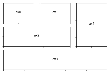
Figure size, aspect ratio and DPI
Matplotlib allows the aspect ratio, DPI and figure size to be specified when the Figure object is created, using the figsize and dpi keyword arguments. figsize is a tuple of the width and height of the figure in inches, and dpi is the dots-per-inch (pixel per inch). To create an 800x400 pixel, 100 dots-per-inch figure, we can do:
fig = plt.figure(figsize=(8,4), dpi=100)
<Figure size 800x400 with 0 Axes>
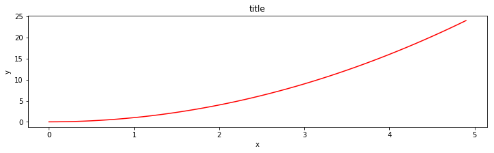
fig, axes = plt.subplots(figsize=(12,3))

axes.plot(x, y, 'r')
axes.set_xlabel('x')
axes.set_ylabel('y')
axes.set_title('title')
Find more at my Github repository Explained.
Show some ![]() by
by ![]() ing it.
ing it.